shadcn/ui Review 2026: Is the Copy-the-Code Component Kit Worth It?
An honest shadcn/ui review from a design engineer: the CLI and registry, Base UI and Radix, Tailwind v4 theming, pros, cons, and when to pick MUI or Chakra.
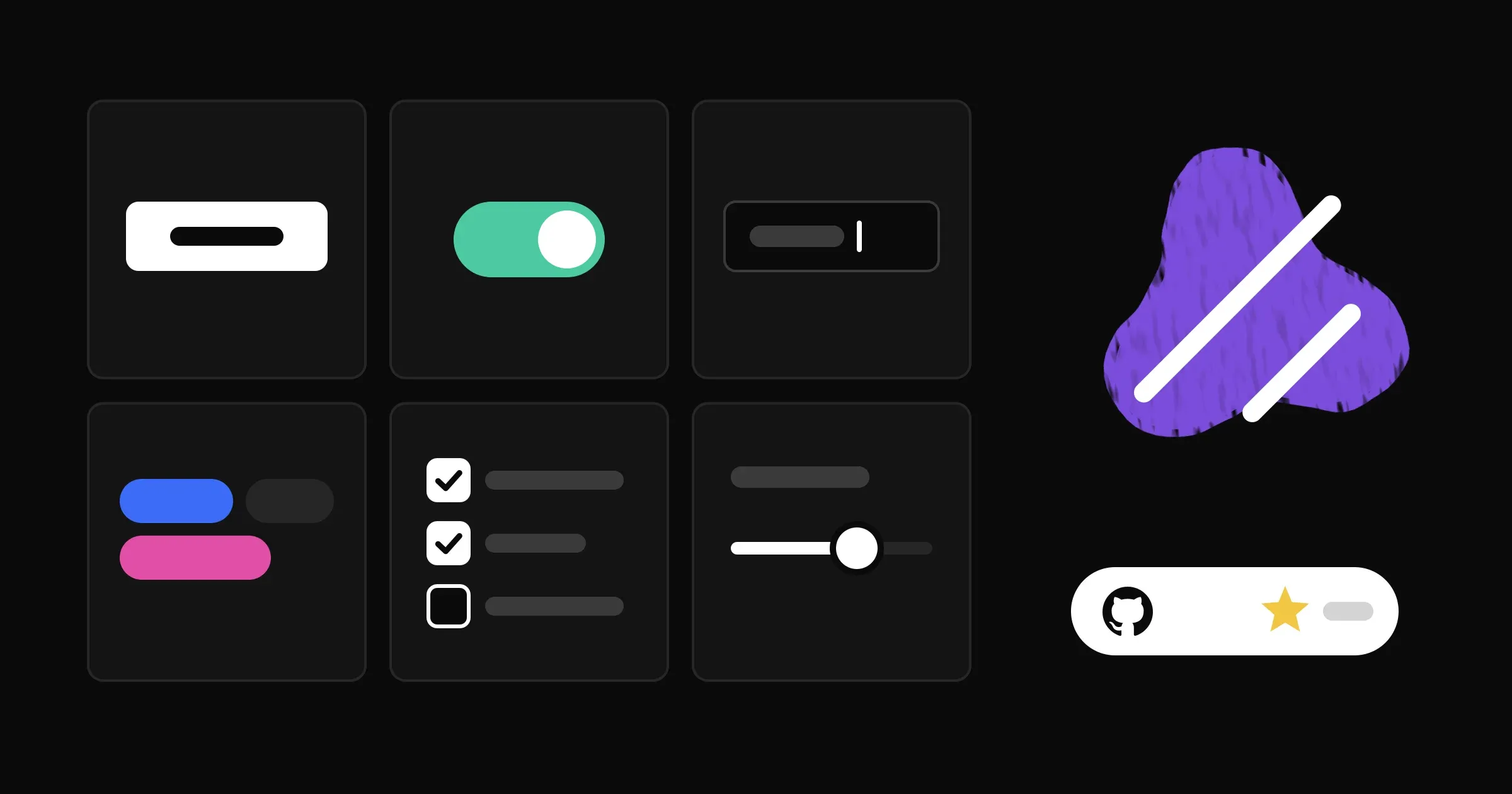
shadcn/ui is the most popular React component library that insists it is not a component library. You do not install it as a dependency. You run a command, and the source code for a button lands in your repo, yours to edit.
That one decision is why people love it and why some teams regret it. I use shadcn tooling on this site and I have built a design system at work, so this review is about the trade itself: what you gain by owning the code, and what you take on.
What shadcn/ui is, at the time of writing
The project lives at github.com/shadcn-ui/ui. At the time of writing (November 2026) it has about 129,000 stars and is MIT licensed. Its own description is “composable, accessible components with thoughtful defaults”, and the docs frame it as a way to build your own component library rather than a library you consume.
In practice it is three things:
- A set of components (button, dialog, select, table, sidebar and many more) written in React and styled with Tailwind CSS.
- A CLI that copies those components into your project, rewrites imports to your paths, and installs the dependencies each one needs.
- A registry format, a flat-file schema that describes components and their dependencies so anyone can distribute their own the same way.
The primitives underneath
The behaviour (focus management, keyboard support, ARIA wiring) comes from a headless primitive library. This part changed a lot over the past year:
- shadcn/create, launched in December 2025, let you choose between Radix and Base UI.
- In July 2026, Base UI became the default for new projects. Radix is not deprecated. The changelog says updates and new components ship for both, and
init -b radixkeeps you on Radix. - Also in July 2026, React Aria was added as a third base.
Base UI is an unstyled, MIT-licensed library from the people behind Radix, Floating UI and Material UI. This site runs @base-ui/react under its shadcn components, set up through the same CLI.
Tailwind v4 and theming
New projects start on Tailwind v4 and React 19, per the Tailwind v4 notes. Components dropped forwardRef, every primitive gets a data-slot attribute for styling hooks, and tw-animate-css replaced the old animation plugin.
Theming is CSS variables. Tokens come in pairs: primary for the surface, primary-foreground for the text on it. Default values are in OKLCH, dark mode overrides the same names under a .dark selector, and an @theme inline block maps the variables to Tailwind utilities like bg-primary. The theming docs show the full set.
:root {
  --primary: oklch(0.205 0 0);
  --primary-foreground: oklch(0.985 0 0);
}
This is the part a design engineer will appreciate most. Semantic tokens in plain CSS are easy to map from Figma variables, easy to audit, and easy to change in one place.
Styles, presets and blocks
You no longer get one look. shadcn/create offers several visual styles (Vega is the classic one; Nova and Mira are compact; Maia is soft and rounded; Lyra is boxy), and the CLI rewrites component code to match, not just colors. CLI v4 added presets, short codes that encode colors, radius, fonts and icons so a whole team can start from the same base.
Blocks are larger, ready-made sections: dashboards, sidebars, login screens. Since February 2026 they ship for both Radix and Base UI.
The CLI and registry are the real product
The components are good. The distribution model is what makes shadcn/ui different.
npx shadcn@latest init
npx shadcn@latest add button dialog
Since CLI 3.0, registries are namespaced, so @acme/button can come from your company’s private registry with token auth. CLI v4 added --dry-run and --diff to see what a registry item will change before and after you install it, plus shadcn info and shadcn docs for quick lookups. There is also an MCP server and an agent skill, which means coding agents can search and add components without guessing.
The registry turns “copy this code” from a one-time paste into a distribution channel you control.
For a team, that is the pitch. You can publish your own design system as a registry, with your tokens, your variants and your rules baked in, and every app pulls from it with the same command. That is close to what I wanted when I built the design system at MedRoyale, which cut design-to-dev handoff time by about 80%: one source of truth that developers adopt without friction.
What I like
You own every line. This site follows a strict flat design: no shadows, no gradients, borders and spacing only. A small lint script fails the check if either sneaks in. With a packaged library, fighting a default style means overrides and specificity games. Here, if a component I add carries a class I do not allow, I delete the class. Done.
Accessible behaviour you did not have to write. Keyboard handling and focus traps in a dialog or a combobox are hard to get right. Base UI and Radix have done that work, and shadcn/ui wires it up for you.
Tokens that match how designers think. Surface and foreground pairs, a radius scale, light and dark from the same names. Mapping a Figma variable collection onto this is straightforward.
It plays well with AI tooling. Plain source in your repo is easy for a coding agent to read and change, and the MCP server and skill make the CLI agent-friendly. I covered how I use an agent on UI work in my Claude Code review.
What I do not like
Updates are your job. There is no npm update that fixes a bug in your copied select. --diff helps you see upstream changes, but merging them into a component you have customised is manual work. Over a year, that adds up.
Everyone’s app can look the same. The defaults are good enough that many teams never change them, and you can spot a default shadcn dashboard from across the room. Presets and styles help, but taste is still on you.
Choice fatigue is back. Three primitive bases, several styles, presets, community registries. That flexibility is great once you know what you want and confusing on day one.
Tailwind is assumed. If your team does not like utility classes, you will spend the whole project fighting the medium.
When not to use shadcn/ui
- You want a complete, opinionated kit and minimal upkeep. A packaged library with semantic versioning is less work over time.
- You need heavy data components out of the box. Advanced data grids, pivot tables and complex date pickers are more complete in mature packaged suites.
- You do not use Tailwind and do not want to.
- Your team has no one to own the components. Copied code without an owner turns into five slightly different buttons.
shadcn/ui vs MUI vs Chakra vs a hand-rolled system
| shadcn/ui | MUI (Material UI) | Chakra UI | Hand-rolled design system | |
|---|---|---|---|---|
| How you get it | CLI copies source into your repo | npm package | npm package | Your own package or folder |
| Styling | Tailwind plus CSS variables | Theme object and sx prop | Style props and theme tokens | Whatever you choose |
| Primitives | Base UI (default), Radix or React Aria | Built in | Ark UI | Your pick, or none |
| Default look | Neutral, with styles and presets | Material Design | Neutral, themeable | Yours |
| Updates | Manual, helped by --diff | Version upgrades | Version upgrades | You maintain it |
| Customisation | Total, edit the source | Through the theme API | Through the theme API | Total |
| Licence | MIT | MIT core, paid tiers for advanced MUI X | MIT | Yours |
| Best for | Product teams on Tailwind who want control | Enterprise apps, data-heavy admin | Fast builds with a styled kit | Large orgs with a dedicated team |
MUI is on v9 at the time of writing, and Chakra UI v3 is built on Ark UI. Both are solid. The difference is philosophical: they want you to configure their components, while shadcn/ui hands you the components to rewrite.
A hand-rolled system gives the most control and costs the most. In my experience the honest middle path is to start from shadcn/ui, then treat the copied components as the first version of your own system, with your own registry once more than one app depends on it.
Verdict: is shadcn/ui worth it?
Yes, for most React teams on Tailwind who care how their product looks and want to own that decision. It gives you accessible behaviour, a token model designers can work with, and a distribution system good enough to build your company’s design system on.
It is not free. You pay in maintenance and in the discipline to make it yours instead of shipping the defaults. If you want a library you install and forget, pick MUI or Chakra. If you are building a design system anyway, shadcn/ui is the best starting point I know of.
If you are choosing a framework to go with it, I compared Astro and Next.js for marketing sites, and the rest of what I use is on my stack page.
FAQ
Is shadcn/ui free for commercial use?
Yes. The repository is MIT licensed, and because the code is copied into your project, you own and ship it like any other source file.
Does shadcn/ui use Radix or Base UI?
Both, plus React Aria. Since July 2026 new projects default to Base UI. Radix is still supported, and init -b radix keeps a new project on it.
Does shadcn/ui work with Tailwind v4?
Yes. New projects start on Tailwind v4 and React 19. Existing Tailwind v3 projects keep working, and components you add stay on v3 until you upgrade.
How do I update shadcn/ui components?
There is no package to bump. Use the CLI’s --diff to compare your copy with the registry version, then merge the changes by hand, keeping your customisations.
Can I build my own design system on shadcn/ui?
Yes, and it is one of its best uses. Edit the components and tokens, then publish them as your own registry so every app installs them with the same CLI.